Previous post

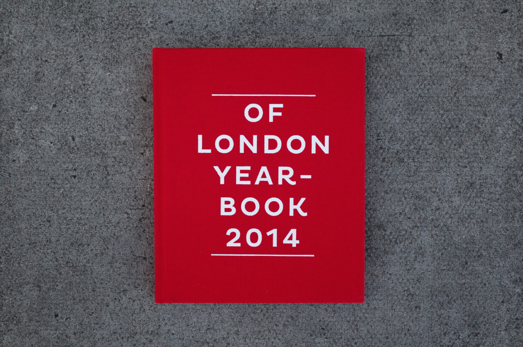
Interview and photography: Henry Kingsford
How did you come to be involved in the first Of London project?
The editor of De Paris Yearbook, Thomas Busettil, was introduced to me by Vincent Coupeau in Berlin about a year ago. I had just seen the De Paris 2013 book and was really stoked on the way it looked and the feeling I got from the mix of work in it – looking at a scene I knew little about but immediately understanding a version of events that had occurred throughout the year. A few months later Thomas hit me up again asking about the possibility of me doing a version for London. It was kind of an easy “yes”.
For those who haven’t seen the first De Paris book, can you explain a little about the wider project?
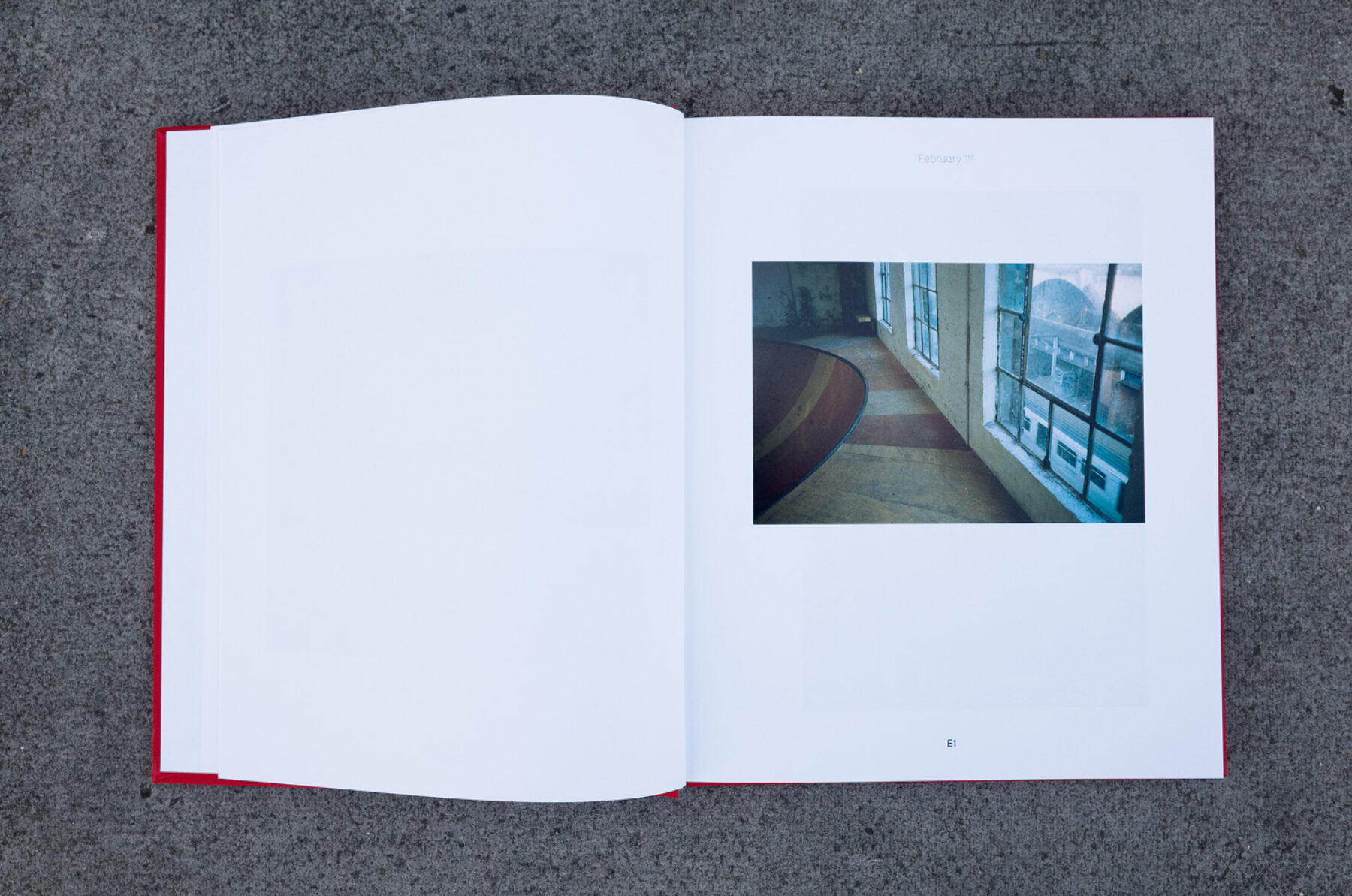
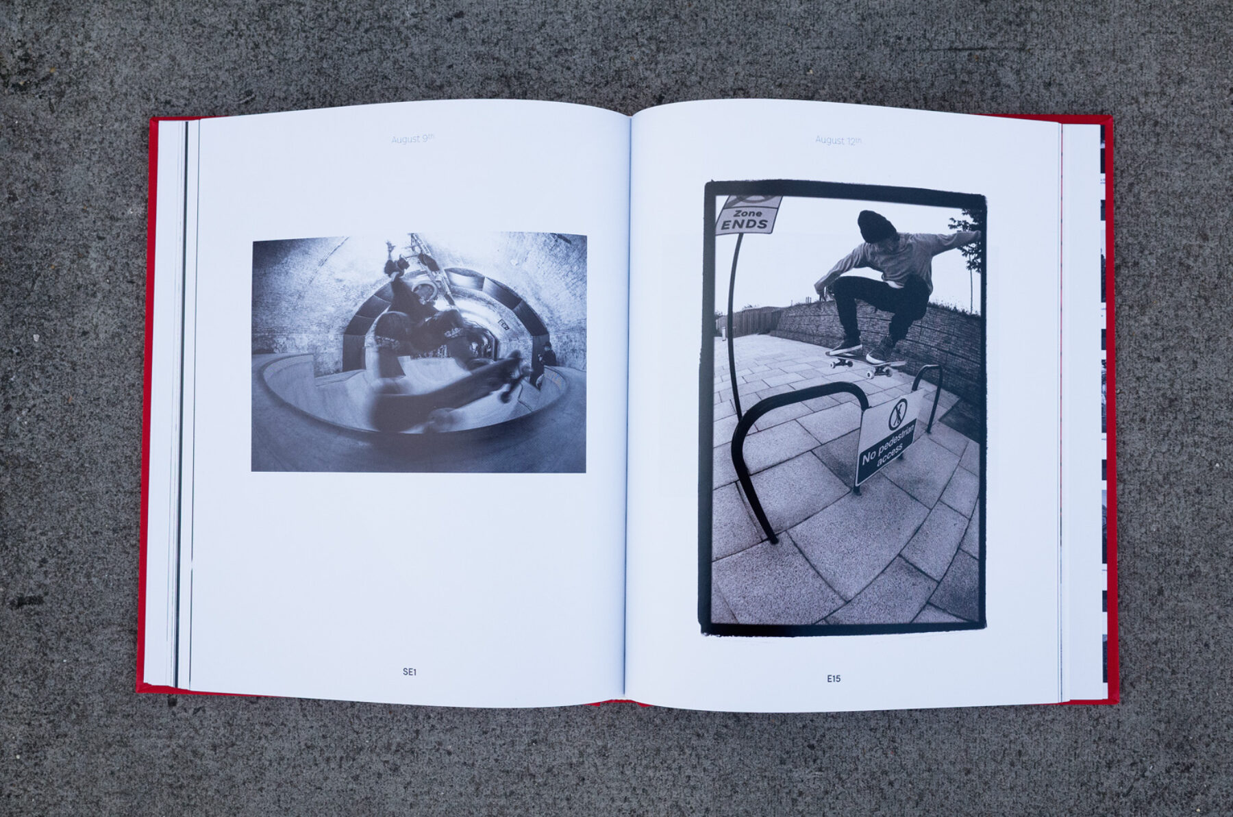
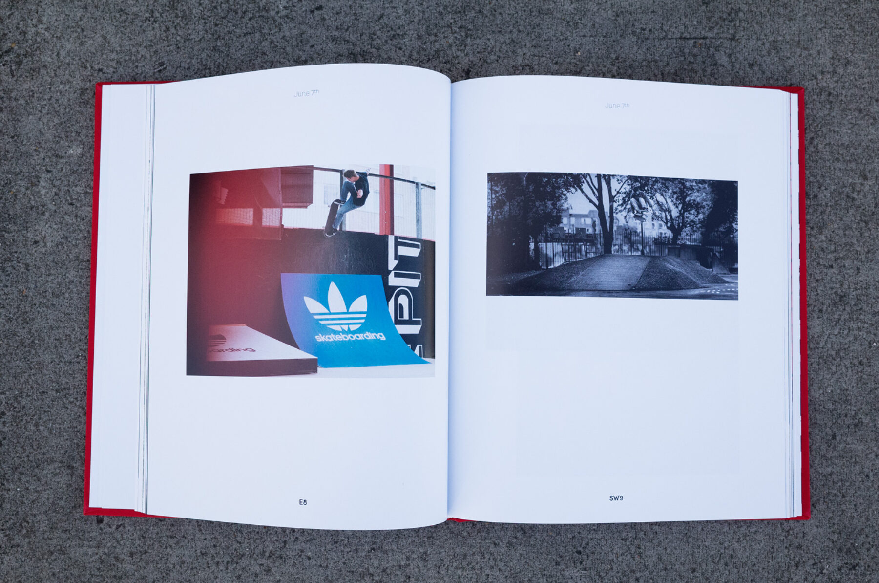
The original version of De Paris Yearbook covered the year 2013. It aimed to give a more complete version of the goings on of the Parisian scene than a magazine could offer. The format was chronological, images were put in their place in the timeline and this allowed them to tell more of a story than they might do in a tour report or something article-based. It makes them relevant somehow. The aim was to broaden the scope of looking at what makes up a scene, not necessarily just what tricks are made by whom. And most of all to show it through the eyes of the skateboard photographers that captured it.
How closely did you follow the De Paris model for the first Of London book?
The 2013 De Paris model was a template I really liked and one that suited the length of the book we set out to make. The ultimate difference with the project is that everything had to fit into a place on the timeline. Deviating from that format for a trip article or something like that seemed odd. One well shot picture of a kid picking his nose suddenly seemed more important than an entire article of hammers when you start looking at it in context. The new version of the Parisian Yearbook has some breaks from the timeline in the form of photographer portfolios. I’m not sure how we’ll develop Of London from here on out but I don’t think it would follow a magazine format.
How did you approach editing something of this scale, essentially distilling a year’s skateboarding in London down to 174 pages? Talk us through the work process, from approaching photographers to editing images down.
Taking 20 plus submissions of who knows how many photos and cutting them for a first edit was one thing. Laying it out and realising I had to cut everything by 50 per cent was the really hard part. Then you get late submissions and it changes again. Once you see an image that works next to another on a spread it starts to become easier. Cutting a well shot, interesting photo because there’s no room is heartbreaking, always is. Maintaining a real sense of narrative was also really tough when you’re having to be brutal with the edit.
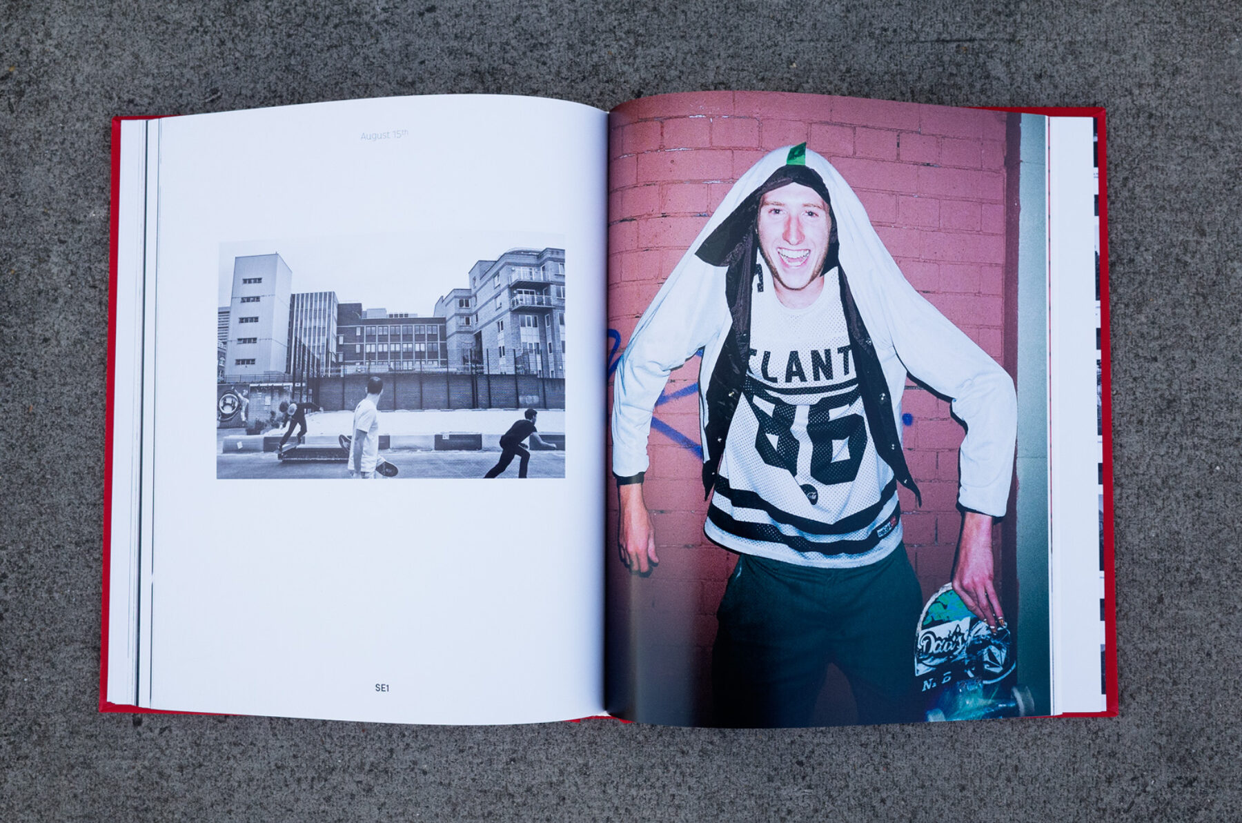
I think the interesting part was finding photographers who didn’t perhaps have experience in what a skate photographer ‘should’ submit: the shots of ‘weak’ tricks, shots with flash drag, shots of unknown guys, unexplainable situations captured off hand. It gives the book a bit of an edge when things aren’t quite so predictable.
Do you find it difficult editing your own photography along side others’?
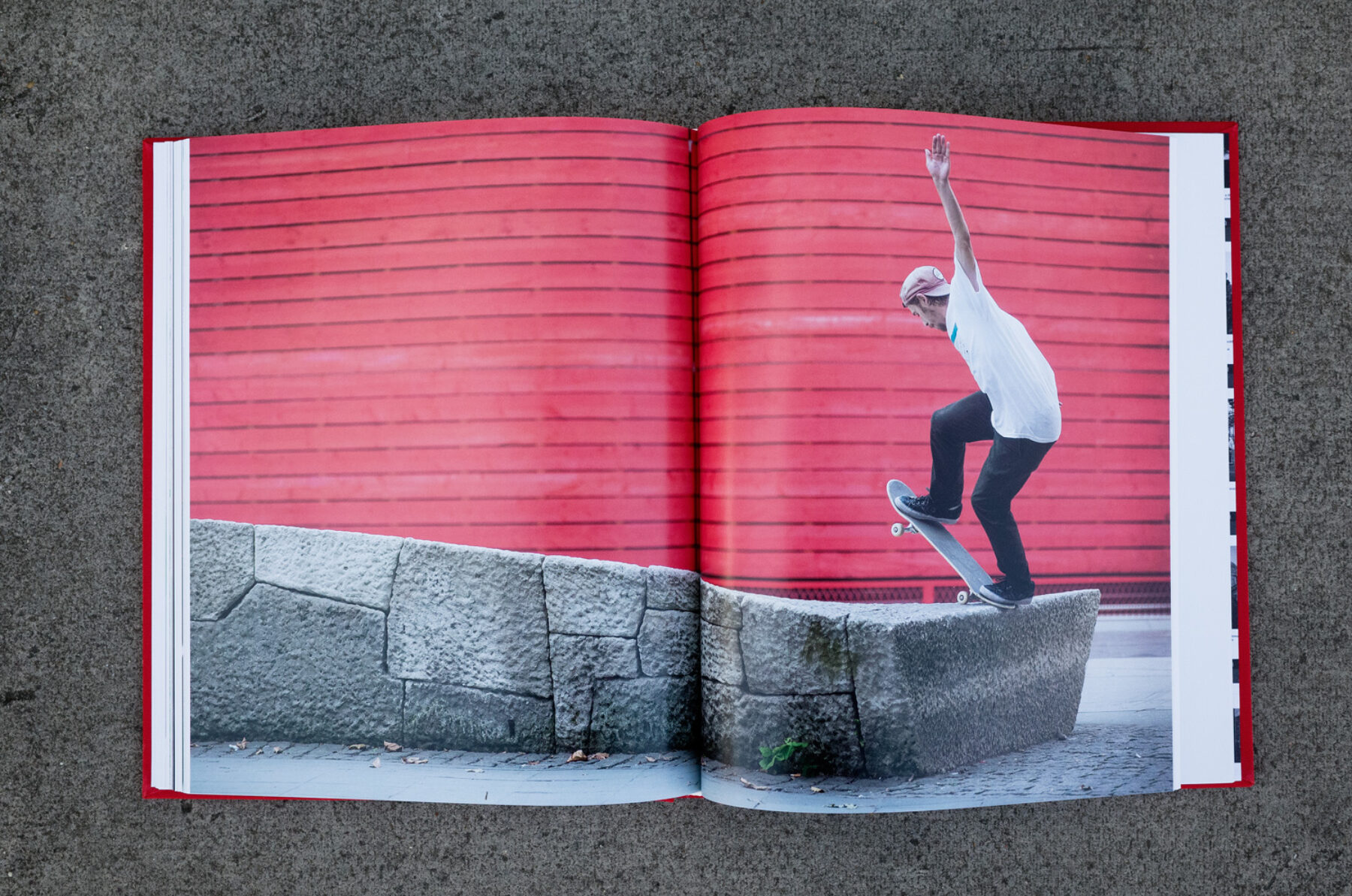
Editing your own photography is the easiest bit. You’re not going to offend anyone by leaving your own stuff on the cutting room floor, and it feels cathartic to do so, to a degree. I mean I can’t really talk, I shot the cover, but that just happened to be the one that worked for the format. We had another one we were going with but a shot of the same angle, better trick cropped up on Instagram so we had to go with mine. That there’s a disclaimer for ballbagging.
There is a lot of non-action photography in the book. Can you explain the decision to include these types of shots.
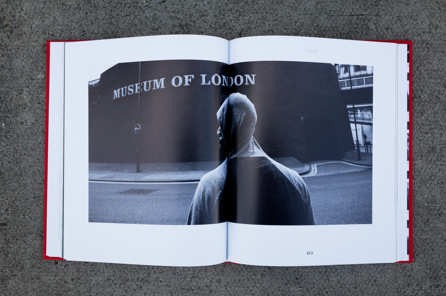
The non-action is as important, if not more important than the action. It can provide an allure to a photo beyond wondering where a spot is or how someone got such and such an angle. An incidental shot can make you ask, “What the fuck is going on there?”
Did you take influence from any photo books outside of skateboarding?
Not really. I like a clean design, so do the guys at De Paris. That’s about it. I think most photographers would agree a bit of white space and some breathing room do wonders for an image.
Did you feel freer editing this book compared to editing Kingpin? I know there were sponsors, but the finished product feels uninfluenced by brands.
I didn’t feel masses of pressure either way. I mean it’s pretty much implicit that the people who support any project – magazine, book, or whatever – get positive representation on the pages of a publication. Perhaps in a magazine it’s more blatant because it’s like: an advert, a tour article, a single page with their new pro guy and a video part online the same week. But I don’t really find that offensive in any way, it’s kind of part of the machine. I think this book is possibly a bit more free feeling because of the nature of the format. If another brand does something in the year covered, it would be wrong to just ignore it completely if it’s interesting and relevant, and I suppose the result is maybe a little less ‘adverty’ for that.
How do you see projects like this fitting into the future of printed skate media in the UK? With Sidewalk and Kingpin no longer in print, it seems like the traditional, monthly, paid-for magazine doesn’t really work as a model any more. Do you see less frequent, higher-quality projects like Of London and free magazines like Grey and North filling that void?
Hopefully we fit into the media line up long-term. I think the book has a different objective to what’s already available at the moment. Of London is more slow-paced, something that might sit on a book shelf rather than in the bog. And then there’s the nostalgic element too, I suppose. I mean magazines offer that too, but I guess this whole publication is time and place specific. Grey and North offer a really good way for skaters to get access to great photography and keep their finger on the pulse of their respective scenes and without a big, national mag left on paper to fly the flag for UK skateboarding they are even more essential. Imagine a world where you don’t see a skate photo in print anywhere, just staring at it on your dusty screen. That would suck balls.
Are you satisfied with the finished product? Which are your favourite images in the book?
I’m really happy with the way it came out to be truthful, which isn’t something I say about a lot of things. I just wish I could have included a few more photos really. Some of the stuff I had to cut I really liked. I don’t think I have a favourite single image, more that I really like some of the juxtaposition of images. I think the LLSB sign-up desk, with Henry (Edwards-Wood) throwing a peace sign opposite Reuben (DeHaan) conked out on the ramp at The Castle (RIP) is my favourite spread.
Tell us about the launch this Saturday.
The launch night is from 5.30 tomorrow at 71a Gallery on Leonard Street, not far from the Old Street benches. We have a selection of images printed large and they are for sale but free to look at. You can come and check the book and we’re also making something to skate – I’m painting it in my driveway right now. So bring your board. There will be lager too, just got to do a couple more runs to Asda tomorrow.
How can people get hold of a copy?
If you can make it along to the opening there will be books for sale, but if you don’t buy it on Saturday check Slam City Skates for a copy, they’ll be holding.
